
There are 3 method to display two divs side by side
- Flexbox method
- Float method
- CSS grid method
Flexbox Method
With flexbox, we can use a more intuitive way of aligning our two div elements.
HTML:
<div class="flex-container">

  <div class="flex-child magenta">
    Flex Column 1
  </div>

  <div class="flex-child green">
    Flex Column 2
  </div>

</div>
CSS:
.flex-container {
    display: flex;
}

.flex-child {
    flex: 1;
    border: 2px solid yellow;
}

.flex-child:first-child {
    margin-right: 20px;
}
With flexbox, we have set display: flex on the parent .flex-containerelement. This turns on flexbox.
Then in each .flex-child element, we are setting flex: 1. This number is like a ratio comparing the widths of each child in the parent flex element.
Since they are the same, the available space will be divided up equally. And since we have two child elements, they will each take up 50%.
Here’s what the resulting code will look like:
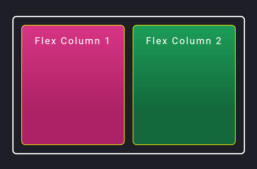
Add space between divs by using a margin, and it will still fit!
Notice that we’ve added space by adding margin-right: 20px to just the first .flex-child element. However, flexbox is intelligent enough to take that extra 20px into consideration when dividing up the rest of the available width.
This means you can add space with margin without having to calculate the exact pixels. Flexbox will fit the content for you!
This is one big reason that I love flexbox.
However, if you have multiple elements that you want to layout in a responsive grid, you don’t always know where you need to add that space between elements.
In our case, if we wanted to stack the two divs one under the other for mobile, we would have to take out that margin-right property for mobile widths.
Or you could add an additional outer element plus padding for each .flex-child element, similar to what we did with the float method.
It’s not 100% intuitive, but it will still work. If you need to create more complex responsive layouts with flexbox, you will need to keep this in mind.
Let’s now take a look at the newest method you can use to place divs side by side: CSS grid.
Float Method
In the float method, we will be using the following HTML markup:
<div class="float-container">

  <div class="float-child">
    <div class="green">Float Column 1</div>
  </div>

  <div class="float-child">
    <div class="blue">Float Column 2</div>
  </div>

</div>
The .float-container is simply the parent element that contains both .float-child elements.
To get the divs side by side, we will use the following CSS rules:
.float-container {
    border: 3px solid #fff;
    padding: 20px;
}

.float-child {
    width: 50%;
    float: left;
    padding: 20px;
    border: 2px solid red;
}
The resulting code will look like this:
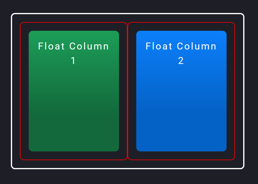
I’ve added borders and padding to the divs so you can more easily see exactly what’s going on. The thicker solid white border on the outside is the .float-container div, which has 20px of padding.
Then each .float-child element has a thinner red border and some more padding. Then the actual color blocks are child elements of the .float-child elements. (You’ll see why in a bit.)
To position the divs side by side, we are using the float property to float each .float-child element to the left.
Since they are both floating to the left, they will display side by side if there’s enough space for both to fit. They do fit because we have two .float-child divs, each at 50% width.
And the space between the divs is created by adding padding in each .float-child div, which then contains the color blocks.
Add space between columns by nesting each column in an outer div
It’s necessary for the color blocks to have an outer div (.float-child) in order to add space and also have both blocks fit side by side.
Well, what if we only had the .float-child divs without padding, and instead tried to add space by putting a margin-right value on the first block like this?
HTML:
<div class="float-container">

  <div class="float-child green">
    Float Column 1
  </div>

  <div class="float-child blue">
    Float Column 2
  </div>

</div>
CSS:
.float-child.green {
    margin-right: 20px;
}
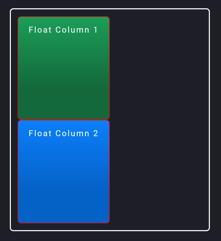
In this case, both .float-child elements would take up 50% of the total width. But the first green element would also have a margin of 20px.
This would mean that both blocks would take up 50% + 20px + 50% width. This would be 20px more than 100% width, meaning there’s not enough room for both to be side by side.
The second blue block would then wrap to the next row underneath the first block, and float to the left there:
You can try to tweak the widths so they are 48% or some other number less than 50% to fit them. But it won’t be exact.
That’s why I personally like wrapping the blocks in an outer div set at 50% width, with padding to add the space between the divs.
Nowadays, it’s easier to use other, newer methods in CSS to place divs side by side rather than with float.
Let’s take a look at one of these: the flexbox method!
CSS Grid Method
And here’s how you can place the two divs side by side, using CSS grid:
HTML:
<div class="grid-container">

    <div class="grid-child purple">
        Grid Column 1
    </div>

    <div class="grid-child green">
        Grid Column 2
    </div>

</div>
CSS:
.grid-container {
    display: grid;
    grid-template-columns: 1fr 1fr;
    grid-gap: 20px;
}
And here’s what the code will look like:
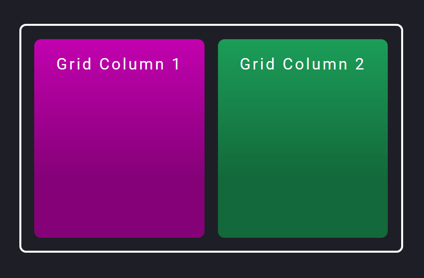
One big change with grid is that you first determine what the grid template will look like. Meaning how many columns and/or rows you want in your layout.
In our case, we want two columns of equal width. So in the parent .grid-container element, we turn grid on with display: grid. Then we add in how many columns we want in our layout with the grid-template-columns property.
We want two columns of equal width, so we set it to 1fr 1fr. This tells the browser to create a two-column layout, and each column takes up 1fr (fr = fractional unit) of space.
The fr unit is a ratio of each column to another, similar to the flex: 1 rule we used in the flexbox method. Having the columns set to 1fr 1fr means that each column will take up the same amount of space.
Adding space between grid items with the grid-gap property
One big benefit to using CSS grid is that you don’t need to use padding or margin to add space between grid items.
You can use the grid-gap (or gap in newer browsers) to automatically add space in your grid template.
We’ve set grid-gap to 20px, so the browser will know to add 20px of space between all items, whether they are side by side or stacked.
And you may have noticed that all the CSS properties for grid were set on the parent .grid-container element. We didn’t actually have to write any CSS for the child .grid-child elements!